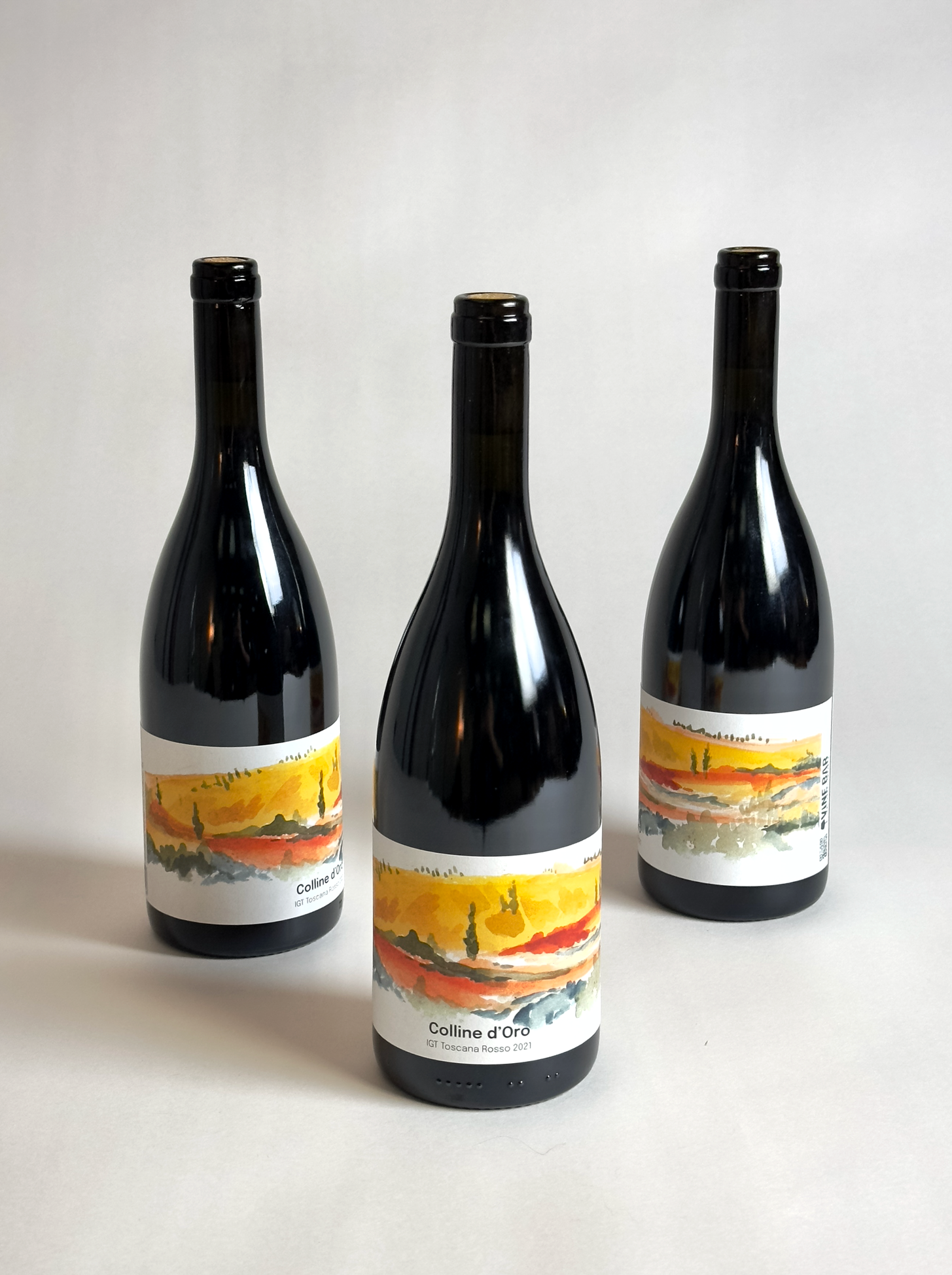
Coline d’Oro Labels
Some projects feel like they’re meant to happen, and the collaboration with Craig and Justina at Vine Bar was one of those. Vine Bar is rooted in artistry, culture, and connection to place felt like a perfect match for my own process. They see wine not just as an agricultural product, but as an expression of culture and the land itself. The word terroir comes up a lot in wine conversations, but for Vine Bar it’s truly the heart of the story.
The Project
Craig and Justina were working with one of their producers to develop a high-quality everyday table wine for their first private label. The goal was to create an original label that could stand on their own while forming the foundation for a flexible design system that could grow with future wines.
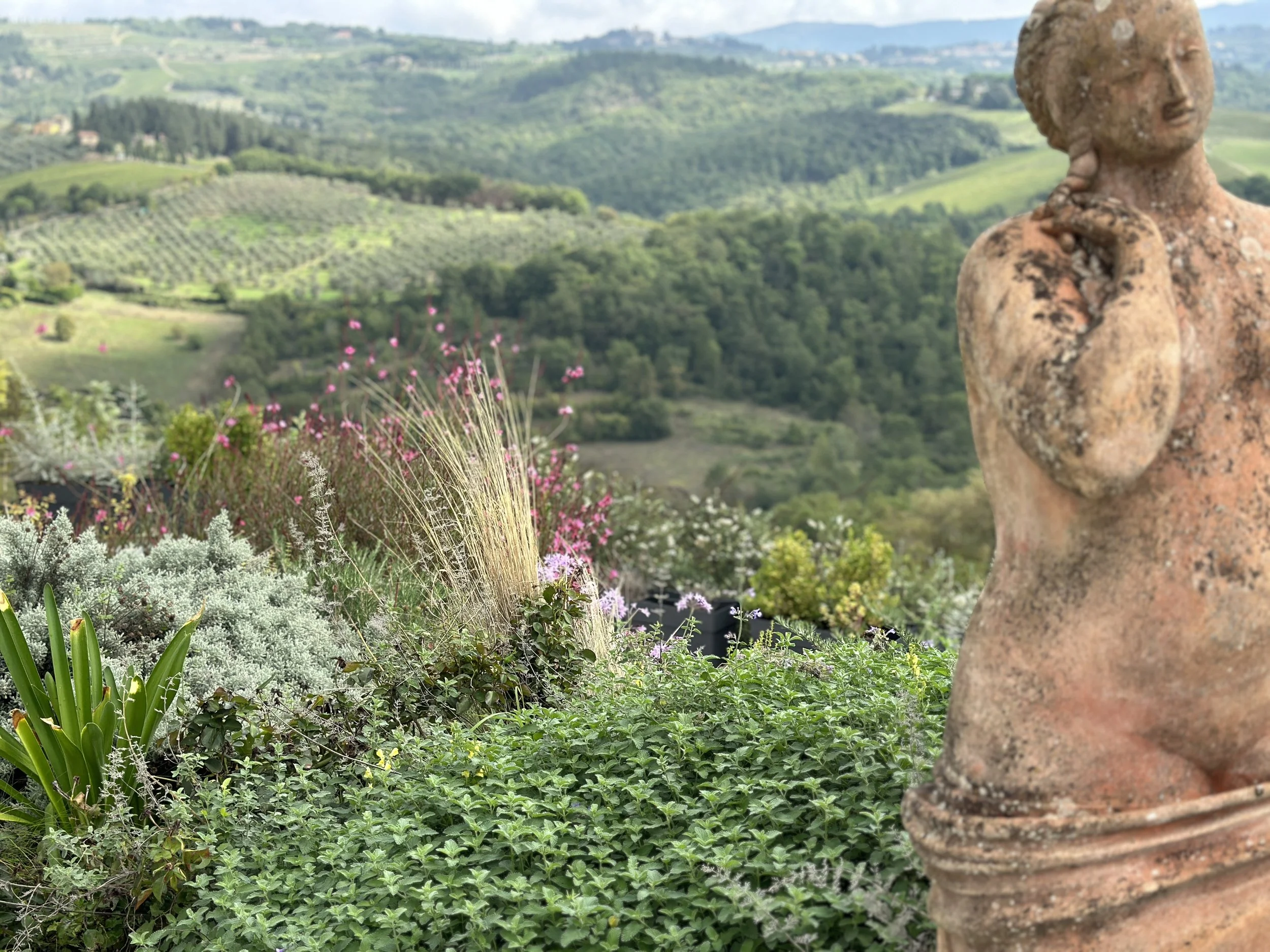
They wanted something that would transport people, a label that evokes that instant recognition of Tuscany’s rolling hills, cypress trees, and sun-warmed abundance. Something that makes you feel like you’ve just stepped off the plane in Florence and into a long lunch in the countryside.
Perhaps the best part about it was that they approached out of a love of my watercolors
The Process
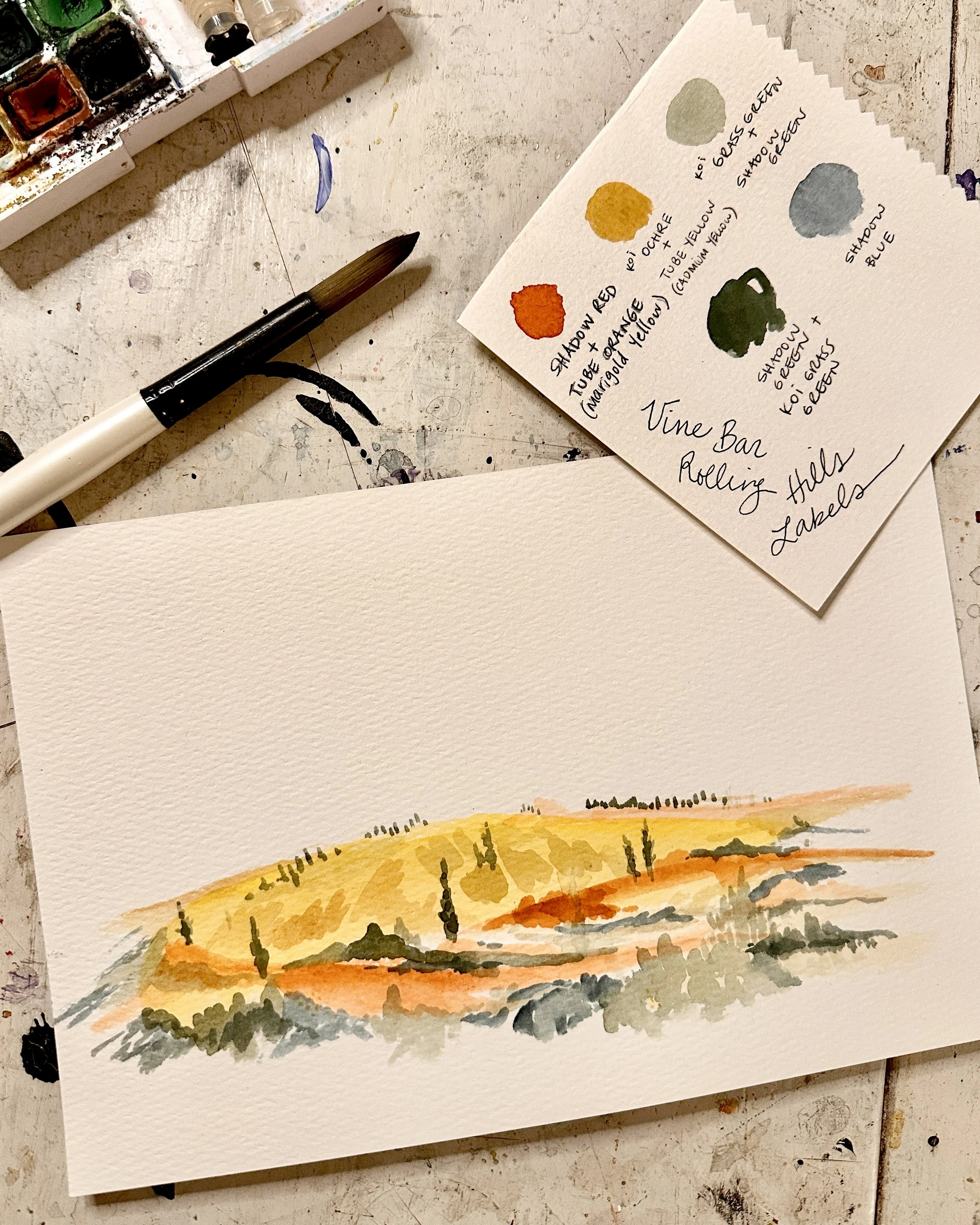
When we started, I already had a trip planned to Tuscany, so Craig and Justina encouraged me to sketch, wander, and soak it all in. I spent those days surrounded by vineyards, old olive trees, and the incredible variety of plants and colors that fill the Tuscan landscape. I came home with watercolor sketches, photos, and sensory notes that became the foundation for the artwork.
Back in the studio, I built three concepts that captured different facets of Tuscany:
Wild Beauty — inspired by the mix of wild and cultivated growth: herbs, flowers, and vines weaving together in organized chaos. The artwork layers watercolor washes with deep tones, balancing softness and structure.
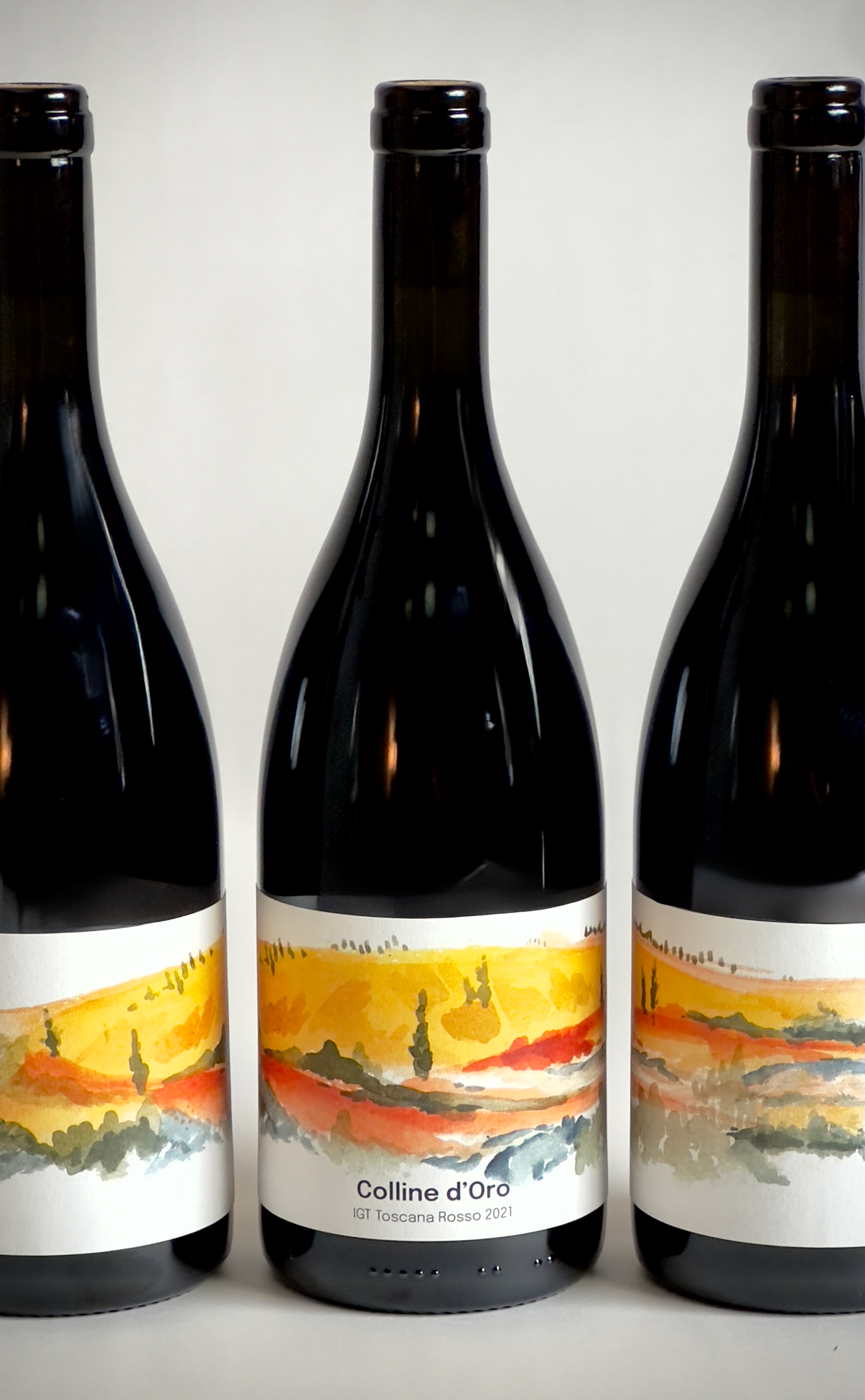
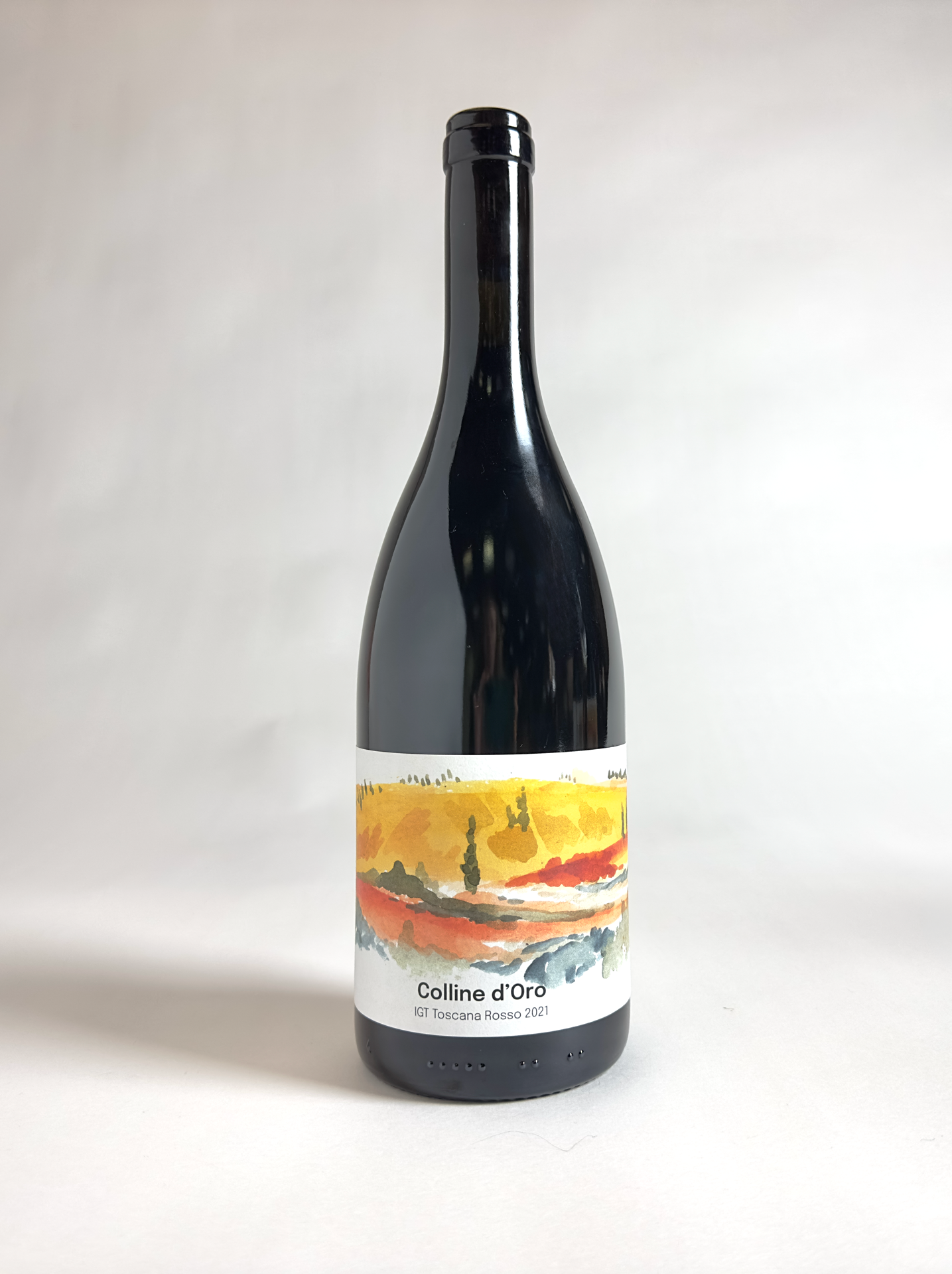
Rolling Hills — a sweeping panoramic view that wraps around the bottle, drawing from Tuscany’s iconic terrain. It’s immersive and contemporary, with modern typography overlaid on the watercolor landscape.
Cypress Trees — clean and bold, featuring four stylized trees based on sketches from my trip. Their tall, rooted forms mirror the balance of growth and groundedness that defines the region.
Each design explored how watercolor and typography could work together to tell a story — tactile, sensory, and deeply tied to place.
The Collaboration
One of the best parts of this project was how collaborative it was. Craig and Justina approached the whole process with so much trust and curiosity. We talked about everything from bottle shapes to sustainable printing materials, and how texture could play a role in the sensory experience. They responded strongly to the Rolling Hills concept, drawn to the idea of a wraparound label that creates multiple compositions as the bottle turns — a design that feels alive and changes as you move with it.
We also talked about future possibilities: expanding the series, creating alternate versions for restaurants and grocery stores, and even using the label artwork for point-of-sale displays or packaging backdrops.
The Result
The final labels capture the essence of Tuscany — earthy, modern, and full of warmth. Each design honors the land and the people behind the wine, while also setting the tone for a whole visual language that can evolve as Vine Bar’s collection grows.
From watercolor sketches in Italy to bottles ready for the shelf, this project has been a dream collaboration. Working with clients who value the artistic process — who see design as storytelling, not just packaging — is what makes this kind of work so meaningful.