Just Beginnings Brand Illustrations
Overview Watercolor and hand-drawn illustration for a nonprofit brand refresh. A modular illustration library supporting a full website redesign.
The Situation Gentry Lusby, was leading a complete brand refresh for Just Beginnings Collaborative, an organization working to end child sexual abuse. Gentry was drawn to the way I use watercolor to depict nature. That response he felt from the Vine Bar label illustrations was exactly what he was looking for on this project.
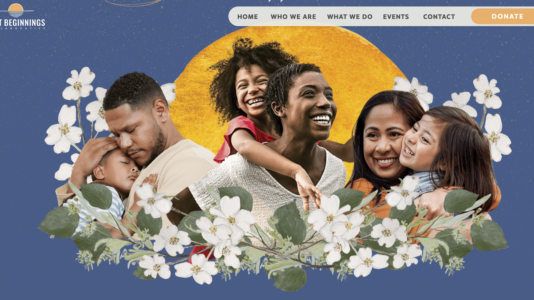
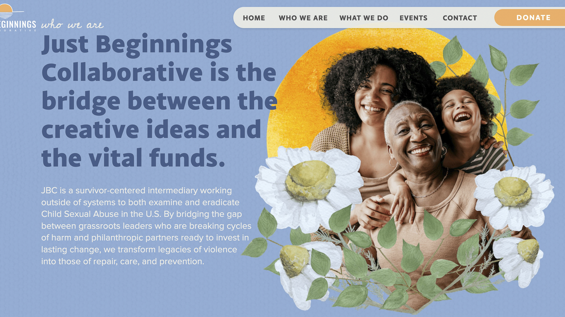
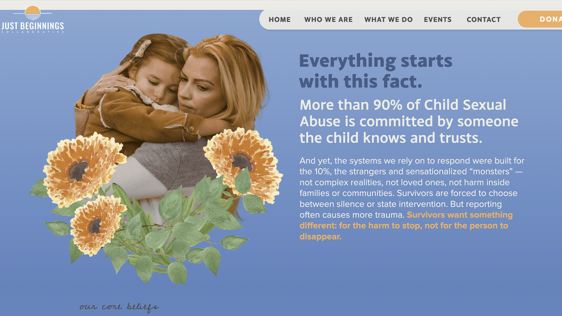
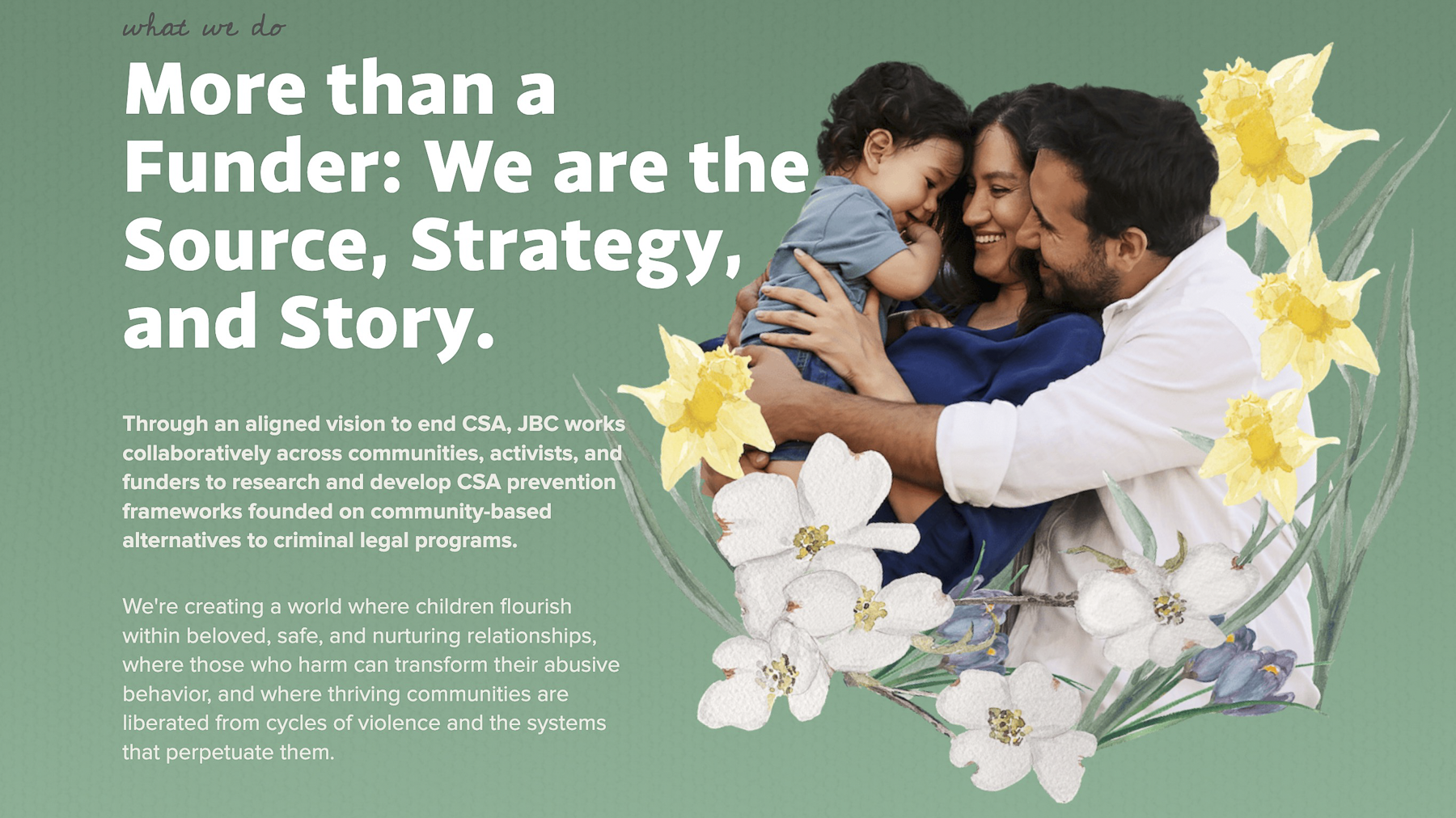
The Need The illustrations needed to feel warm, grounded, and alive. They had to be expressive enough to carry emotional weight, but modular enough to function as a flexible asset library for designers. They also needed to be saturated and substantial, able to hold their own when layered into photo collages.
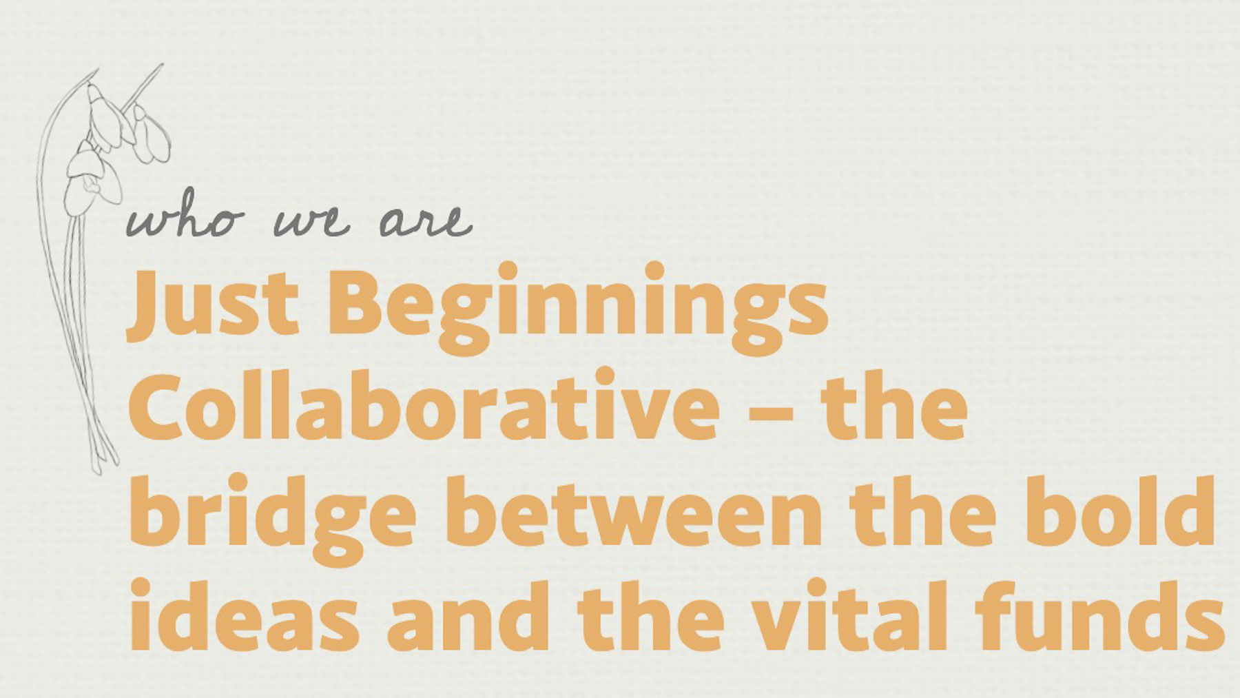
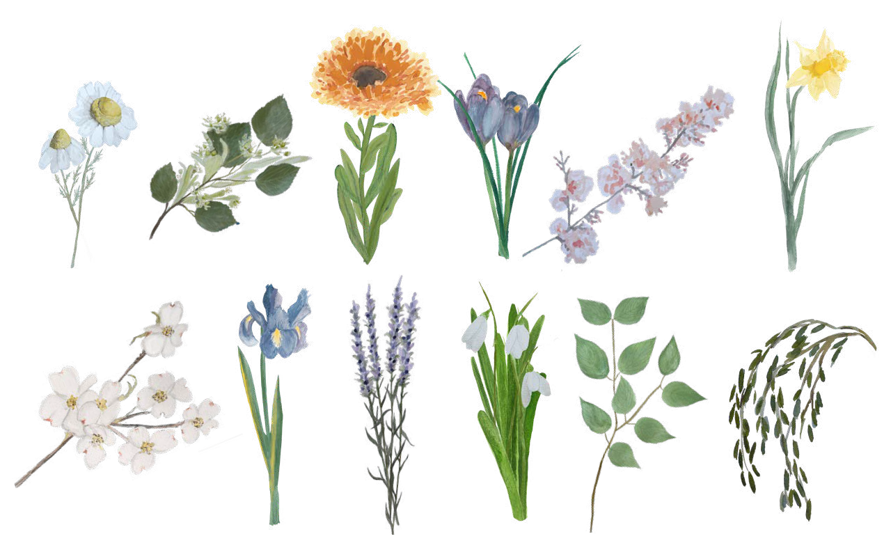
My Role Following the design brief and using resource material of specific flowers and plants, I created watercolor botanicals rooted in specific symbolic meaning, alongside line drawing versions of those same elements that appear as delicate, layered details throughout the site. I also collaborated closely with Gentry to develop five icons representing JBC's core approach -- a process that felt genuinely co-creative.
One of the more technically demanding aspects of the project was translating the watercolor paintings into digital assets that would hold up on dark backgrounds. Watercolor's transparency reads naturally on white, but on navy it requires a different approach entirely. After scanning each piece, I tested how the work appeared in context and reworked areas digitally to retain the delicate, luminous quality of the original without losing detail or depth.
My years of design experience made it easy to deliver assets with the designer's needs in mind, thinking about how each element would scale, layer, and behave across different contexts.
Outcome The illustrations landed from the very first sketches. Gentry responded with real feeling to the initial work, which set a tone of trust and ease for the rest of the collaboration. I even heard feedback that someone from his team was brought to tears when they first saw the watercolors. There’s nothing better than knowing that you hit the mark and also created work that really connects with someone.
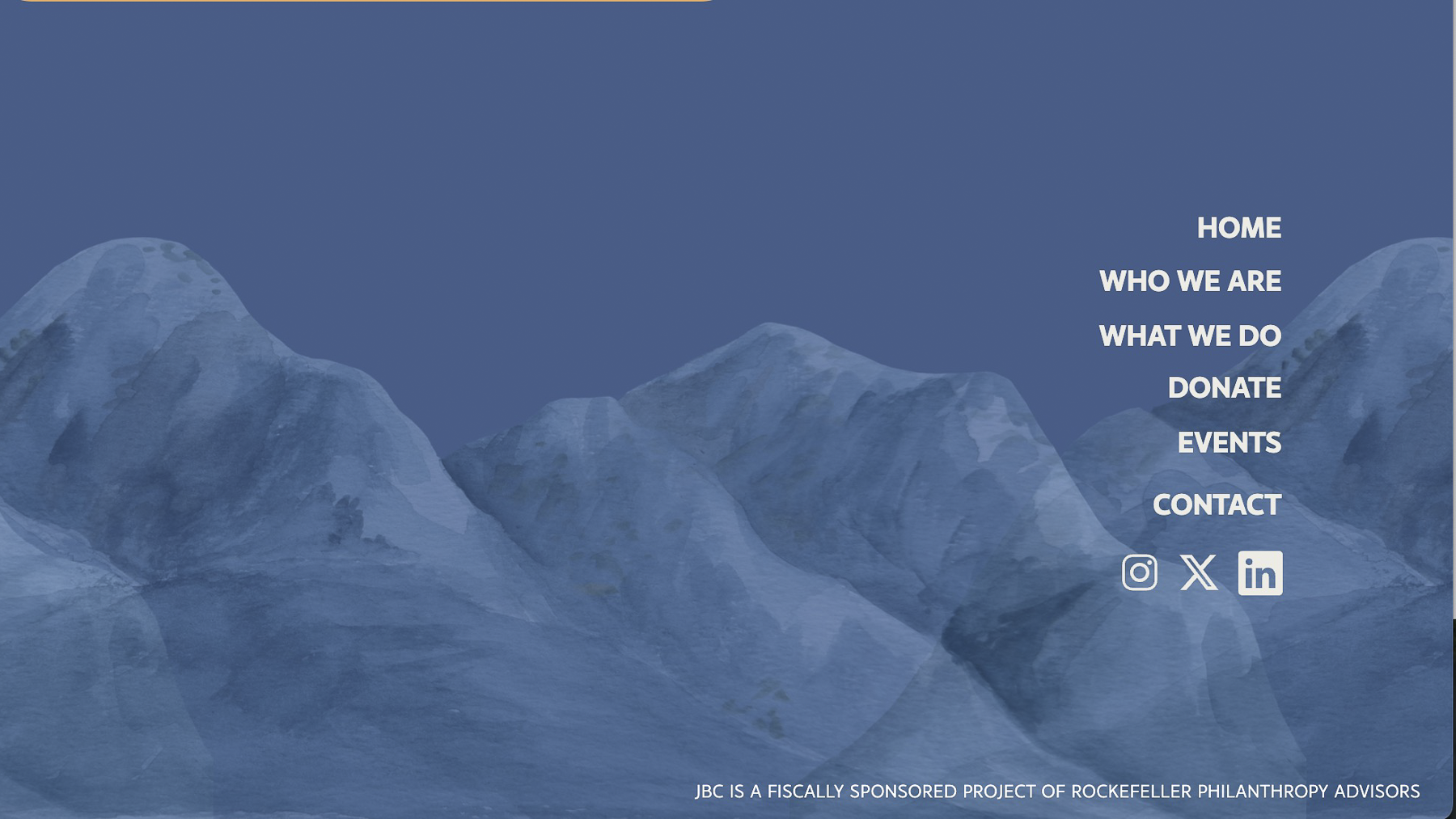
The finished pieces are woven throughout the JBC website, framing photography, grounding page sections, and bringing warmth to difficult subject matter.
Reflection This project is a good example of what I love most about illustration work, collaborating with someone who knows exactly what they need, while delivering something that runs deeper than the brief. My connection to the natural world made studying and interpreting these specific plants and flowers feel less like an assignment and more like a conversation.